NBA Team Uniform/Logo UN-Appreciation Thread

BlackFeet

Rookie
Joined
May 14, 2013
Messages
989
Reputation
0
Daps
311
Reppin
4G
I'll start off with two teams that, imo, really fukked up. First, the Washington Wizards. These new uniforms are TRASH. I guess people like them 'cause they look like the old Bullets unis, but honestly, those were TRASH too. :scusthov: :why: 
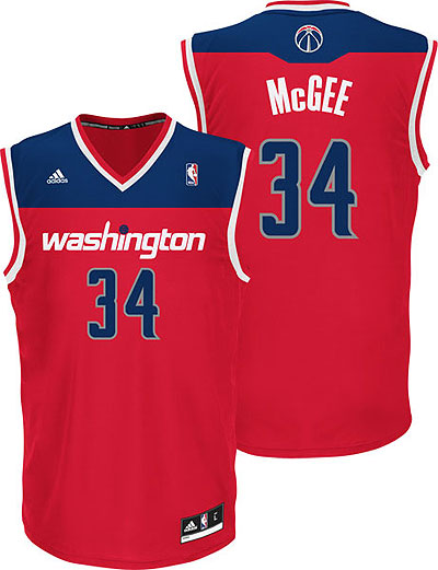
The stripe across the middle of the jersey just doesn't belong, it screws up the continuity and just looks plain stupid. And the red color isn't as swag as the red colors of the Chicago organization. I honestly didn't see the problem with the previous team colors, I thought those were cool. Is it just 'cause it wasn't the conventional and BORING red, white, and blue?. I mean, if the jerseys looked anything like this, I wouldn't be mad :manny:
NewWiz.jpg


And the Wizards have to do something about their logo. It wasn't the ideal logo when the Wizards were born, and looks even worse with these new color schemes.


Second, the Philadelphia Sixers. Their current unis, just... no :huhldup:
They're too damn boring, and don't look anything like the '83 jerseys.
ff_1256196_xl.jpg


Again, I don't see what the problem with the previous jerseys were, that black and gold was on point, it was original, definitely more poppin' than these currents uniforms.
56920734_display_image.jpg


So what teams would y'all like to see have a uniform and/or logo overhaul?
 

Air Nikes N Hats

Poor mans Johnny Football Lifestyle!
Joined
May 28, 2012
Messages
2,749
Reputation
375
Daps
4,480
Reppin
SINY!!
-hate the current Orlando Magic logo/jersey. Seems they have regressed with every change

-OKC's jerseys are too plain, and the color scheme has too much going on

-agree with the OP about the Wizards

-ATL Hawks jersey is eh....would like better in the red and yellow color scheme

That's all I can think of for now
 

Sonny Corinthos

Superstar
Joined
May 1, 2012
Messages
25,731
Reputation
1,327
Daps
28,502
Reppin
Port Charles, NY
-hate the current Orlando Magic logo/jersey. Seems they have regressed with every change

-OKC's jerseys are too plain, and the color scheme has too much going on

-agree with the OP about the Wizards

-ATL Hawks jersey is eh....would like better in the red and yellow color scheme

That's all I can think of for now

All of em:yeshrug:

Cept the Lakers, Spurs, Celts and Heat of course, I miss the old simpler looks. Now all these jerseys look the same. I dont see the need for all this change and while we are at it the courts too, some of them shyts make watching games unbearable. How can nikkas not get eye strain from that Warriors court?:dahell:
 
Joined
May 2, 2012
Messages
3,839
Reputation
571
Daps
10,042
on positive news, those miami jerseys with the numbers havin a white shadow and the ones with the stripe are fire
 

Air Nikes N Hats

Poor mans Johnny Football Lifestyle!
Joined
May 28, 2012
Messages
2,749
Reputation
375
Daps
4,480
Reppin
SINY!!
All of em:yeshrug:

Cept the Lakers, Spurs, Celts and Heat of course, I miss the old simpler looks. Now all these jerseys look the same. I dont see the need for all this change and while we are at it the courts too, some of them shyts make watching games unbearable. How can nikkas not get eye strain from that Warriors court?:dahell:

Definitely in favor of a more simple, clean look.....the over the top cartoonish shyt is an eye sore and your right about some of these arenas....who really pays attention to that shyt?
 

Sonny Corinthos

Superstar
Joined
May 1, 2012
Messages
25,731
Reputation
1,327
Daps
28,502
Reppin
Port Charles, NY
Definitely in favor of a more simple, clean look.....the over the top cartoonish shyt is an eye sore and your right about some of these arenas....who really pays attention to that shyt?

Makes it tough to watch, I cant even watch OKC games cuz of that loud shyt. It makes a difference to have the simpler cleaner look, I even noticed the Knicks court was bright as shyt to this season.:why:
 

Arcavian

Him Downstairs
Supporter
Joined
May 1, 2012
Messages
20,541
Reputation
4,003
Daps
68,937
Reppin
Texas
The celtics green and gold and green and black are my favorites :blessed:


The hawks or the rockets need to run with red and yellow on a regular basis


There are way too many red and blue teams, change that shyt up

And bring back the bullets, thats my 2k13 squad
 

pete clemenza

Veteran
Supporter
Joined
May 1, 2012
Messages
36,621
Reputation
3,374
Daps
88,739
Reppin
Cali
ff_1256196_xl.jpg


Again, I don't see what the problem with the previous jerseys were, that black and gold was on point, it was original, definitely more poppin' than these currents uniforms.
56920734_display_image.jpg


So what teams would y'all like to see have a uniform and/or logo overhaul?
Both of these Sixers jerseys were always trash to me. I like the ones they have now plus I like how they brought back the old classic logo

-I like Brooklyn's colors and unis but why did they keep the 'Nets' name? they should've left that shyt in New Jersey

-Even though its a white hand, I like this old Pacer logo as compared to the one they use now
pacers.gif


-The Bucks old logo and jerseys:ohlawd:

retro_logo_200w.jpg


mn-buc84r04.jpg


-The Thunder is all over the place

-I might be the only one but I'm not really feelin' the Warriors current jerseys with the logo in the middle of the jersey
 

pete clemenza

Veteran
Supporter
Joined
May 1, 2012
Messages
36,621
Reputation
3,374
Daps
88,739
Reppin
Cali
No matter how good or how shytty the Dodgers are, their unis are timeless
?1306732147

-I was happy when Bmore brought back the fat-smiling bird and threw that generic bird in da bushes:ahh: I'm a Dodger fan but I love everything about the Orioles since I was a kid. Plus they brought back the retro-baseball only stadiums back into the league with Camden Yards
Baltimore_orioles_logo_2012_-_present.jpeg
 

Big Blue

Superstar
Joined
Sep 26, 2012
Messages
19,525
Reputation
949
Daps
50,650
Reppin
Brooklyn
This is the NFL but what the fukk were the Seahawks thinking?
2017898267.jpg


This could have been so clean with throwback colors :sadcam:
Nike-Seahawks-unis-630x390.jpg
 

BlackFeet

Rookie
Joined
May 14, 2013
Messages
989
Reputation
0
Daps
311
Reppin
4G
No matter how good or how shytty the Dodgers are, their unis are timeless
?1306732147

-I was happy when Bmore brought back the fat-smiling bird and threw that generic bird in da bushes:ahh: I'm a Dodger fan but I love everything about the Orioles since I was a kid. Plus they brought back the retro-baseball only stadiums back into the league with Camden Yards
Baltimore_orioles_logo_2012_-_present.jpeg

:ehh: Yea, I'll give ya the Baltimore look. Orioles got some cool ass jerseys
 
Top