
88m3
Fast Money & Foreign Objects
Troubling inequities are revealed when you look at the country by total property values.
Max Galka, founder of Metrocosm, has posted a series of cartograms over the past few weeks to illustrate just how messed up the city is. As Galka notes, New York City’s 305 square miles make up 8/1000ths of 1 percent of the land area of the United States. Yet New York City accounts for 5 percent of the nation’s housing value—more than every single state but four (one of which is, of course, New York state).
one that compares the property value of NYC neighborhoods with various U.S. states. The total value of all the residential property in Kentucky ($300 billion) falls just short of the value of all the housing property in Queens ($317 billion). The housing value of the Upper East Side all by itself is greater than that of six states.
Where it gets really interesting is at the county level.
(Max Galka/Metrocosm)
This cartogram, which compares property values between counties across the continental United States, looks like bad news from a gastroenterologist. What this in fact shows is that just a handful of counties account for the vast majority of property values in the U.S. The distortion is so severe that it doesn’t look like a map of the U.S. at all.
To make this function even clearer, Galka created an animated GIF, which toggles between the map of land area that we know and love and the map of residential property values that looks like irritable bowel syndrome:
(Max Galka/Metrocosm)
The value of housing for most counties in the U.S. is marginal compared to elite counties on the East and West Coasts, Texas, Florida, plus some scattered counties coextensive with major cities or metro areas.
huge drain on the nation’s economy.
Folks who can’t afford to live in those places don’t get to take advantage of those labor markets. The demand to live in these places is soaring, but the desire among incumbents to accommodate newcomers is low. Hence NIMBYism, high housing costs, severe inequality—the whole shebang.
http://www.citylab.com/housing/2015/07/mapping-the-us-by-property-value-instead-of-land-area/397841/
thoughts?
- KRISTON CAPPS
- @kristoncapps
- 1:10 PM ET
- 2 Comments
Max Galka, founder of Metrocosm, has posted a series of cartograms over the past few weeks to illustrate just how messed up the city is. As Galka notes, New York City’s 305 square miles make up 8/1000ths of 1 percent of the land area of the United States. Yet New York City accounts for 5 percent of the nation’s housing value—more than every single state but four (one of which is, of course, New York state).
one that compares the property value of NYC neighborhoods with various U.S. states. The total value of all the residential property in Kentucky ($300 billion) falls just short of the value of all the housing property in Queens ($317 billion). The housing value of the Upper East Side all by itself is greater than that of six states.
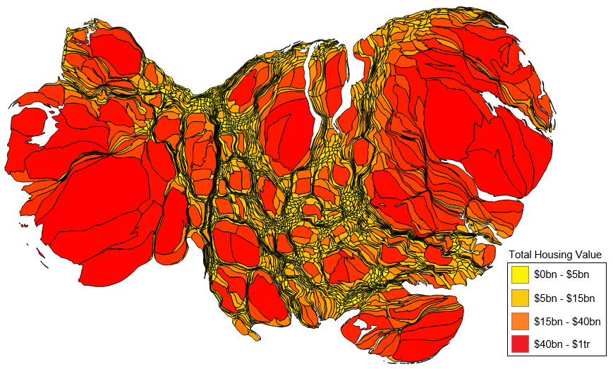
Where it gets really interesting is at the county level.
(Max Galka/Metrocosm)
This cartogram, which compares property values between counties across the continental United States, looks like bad news from a gastroenterologist. What this in fact shows is that just a handful of counties account for the vast majority of property values in the U.S. The distortion is so severe that it doesn’t look like a map of the U.S. at all.
To make this function even clearer, Galka created an animated GIF, which toggles between the map of land area that we know and love and the map of residential property values that looks like irritable bowel syndrome:
(Max Galka/Metrocosm)
The value of housing for most counties in the U.S. is marginal compared to elite counties on the East and West Coasts, Texas, Florida, plus some scattered counties coextensive with major cities or metro areas.
huge drain on the nation’s economy.
Folks who can’t afford to live in those places don’t get to take advantage of those labor markets. The demand to live in these places is soaring, but the desire among incumbents to accommodate newcomers is low. Hence NIMBYism, high housing costs, severe inequality—the whole shebang.
http://www.citylab.com/housing/2015/07/mapping-the-us-by-property-value-instead-of-land-area/397841/
thoughts?
