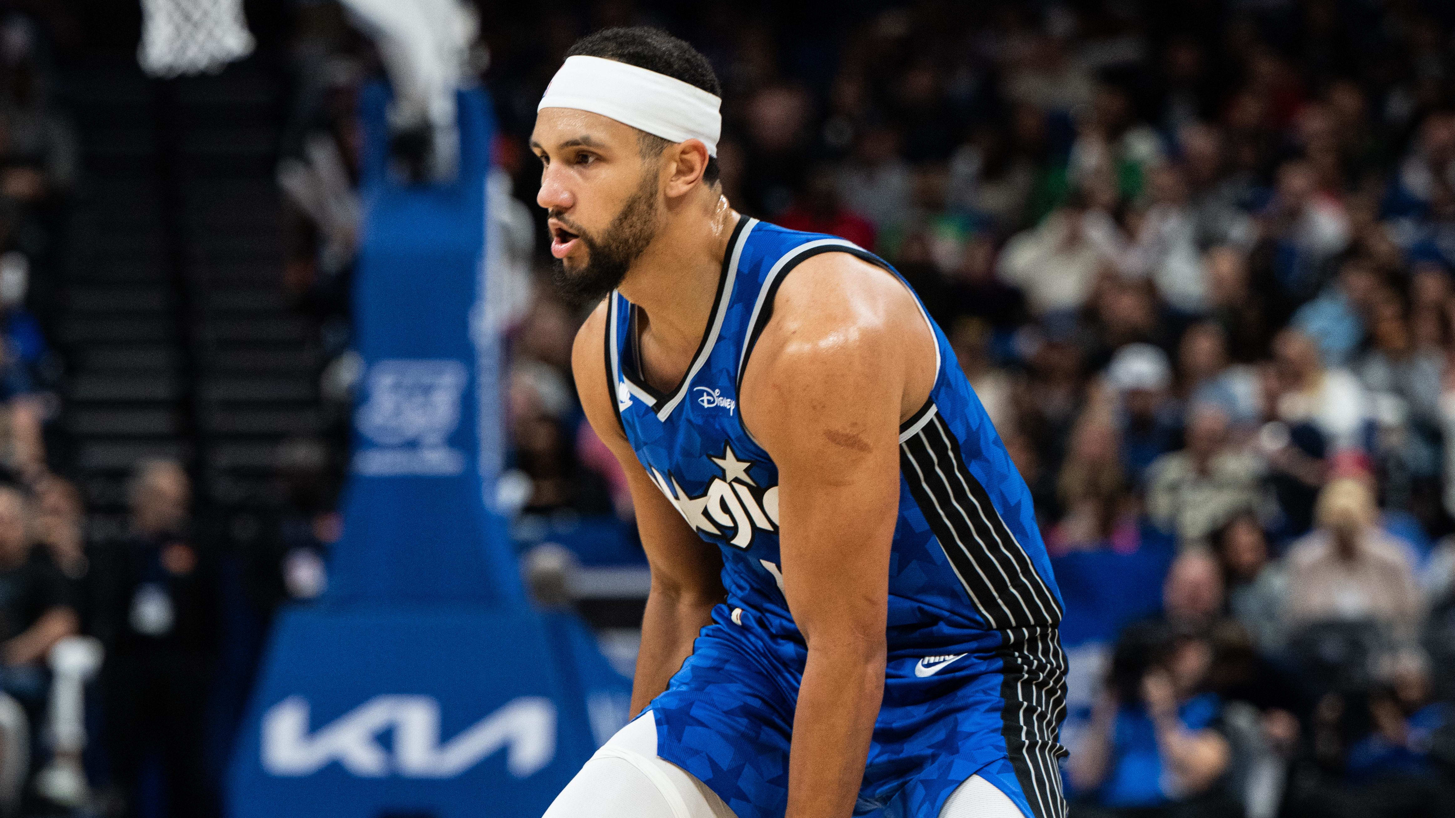
I like the new logo. I don't like the two tone jersey, but it might grow on me.
You are using an out of date browser. It may not display this or other websites correctly.
You should upgrade or use an alternative browser.
You should upgrade or use an alternative browser.
Orlando Magic unveil long overdue rebrand
- Thread starter FAH1223
- Start date
-
- Tags
- nba orlando magic
More options
Who Replied?McGrady era and Shaq/Penny era were the best. They should just make the Mac jerseys the regulars and the Shaq/Penny joints the alternates.
7th Letter Specialist
We Love Money, We Love Weed!
As I think about this more, I can kinda see why they decided not to go all black. I think at least every team has at least one predominantly black uni.
Redwood
Superstar
Mixed feelings about it. I miss the 90s Magic logo 

Tmac era jerseys with the hologram stars was better
Fire..way better than the ones they’ve been wearing since the Dwight era.
This is why I like the discourse about this stuff, because I was on the complete opposite side on these. I hated that busy ass Frankenstein jersey. It's like they couldn't decide what they wanted to roll with, stars or stripes, and just said "fukk it, find a way to get it all on there".just go back to this shyt full time
retarded

I never liked those embossed stars TMac jerseys, partly because I could not understand why a team that had got it perfect on their first shot with the pinstriped Penny and Shaq joints would just change it up, and partly because it reminded me of that fake hologram look from trading cards and comic books that was popular in the 90's- early 00's. But I've grown to understand the appeal of those. It was a unique look. This version still too busy for me though. I guess I'm just old school. Classic looks are classic for a reason. And the original pinstripes were a perfect jersey.
Last edited:
thatrapsfan
Superstar
White ones are really good.
That’s fairThis is why I like the discourse about this stuff, because I was on the complete opposite side on these. I hated that busy ass Frankenstein jersey. It's like they couldn't decide what they wanted to roll with, stars or stripes, and just said "fukk it, find a way to get it all on there".
I never liked those embossed stars TMac jerseys, partly because I could not understand why a team that had got it perfect on their first shot with the pinstriped Penny and Shaq joints would just change it up, and partly because it reminded me of that fake hologram look from trading cards and comic books that was popular in the 90's- early 00's. But I've grown to understand the appeal of those. It was a unique look. This version still too busy for me though. I guess I'm just old school. Classic looks are classic for a reason. And the original pinstripes were a perfect jersey.
Either just the stripes or the stars joint is sufficient
To me the stars one one is the nbas goat jersrys
Respect. That's how I feel about the original pinstriped one. Those shyts took the hood by storm, and when they rolled out that blue one, it was a fukking wrap!That’s fair
Either just the stripes or the stars joint is sufficient
To me the stars one one is the nbas goat jersrys
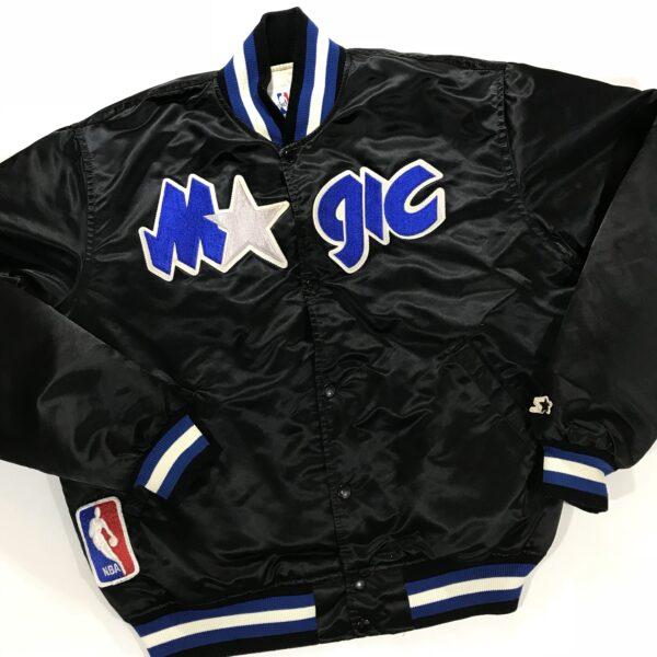
GOAT starter jacket


Everything peaked in the 90sLooks like the 90s one with with a cleaner number and “cleaner” font
Imo nba Jerseys peaked in the 90s so I like them
