
You are using an out of date browser. It may not display this or other websites correctly.
You should upgrade or use an alternative browser.
You should upgrade or use an alternative browser.
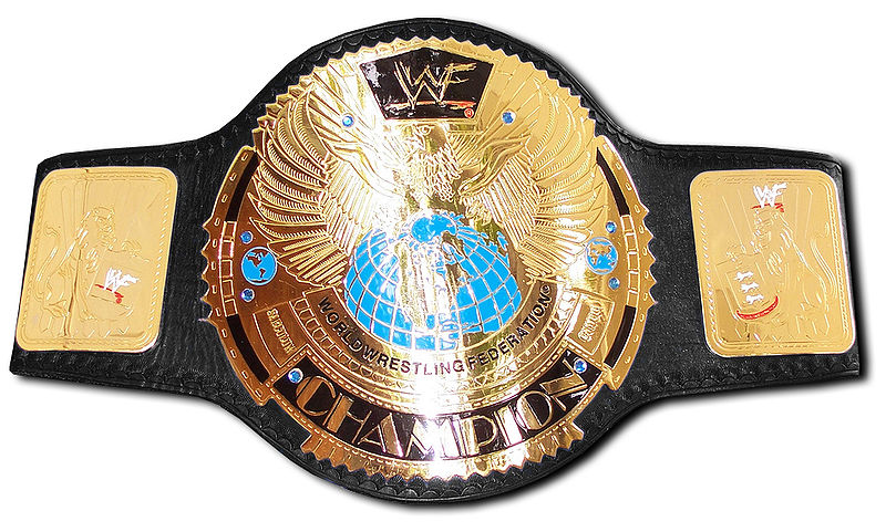
UNIVERSAL TITLE DESIGN
- Thread starter Art Barr
- Start date
More options
Who Replied?Art Barr
INVADING SOHH CHAMPION
Who the hell is "Joe"??
What swaggerless slang lacking city are you from?
Art Barr
Art Barr
INVADING SOHH CHAMPION
We can only pray they get an ounce of style and intelligence on that decision.
I am all for a WWE iwgp title.
Only new belt I ever seen give my love for the awa title a run for the money.
Art Barr

MOST underrated title belt in any promotion history.
I love this belt.
Art Barr

MenacingMonk
War & Peace
TSC stays being GOAT status

Art Barr
INVADING SOHH CHAMPION
TSC stays being GOAT status
Real talk,...
I hope that picture becomes an internet legend.
shyt is greatness!
That shyt is I'm da bast comedic genius....
shyt got the worst best beat box bass line in troll comedic rap history.
nikka that sun just fukks me completely up.
My side hurts so bad from this shyt I had to take a break from watching this shyt for like five months or so.
Art Barr

Art Barr
INVADING SOHH CHAMPION
TheGodling
Los Ingobernables de Sala de Cine

Art Barr
INVADING SOHH CHAMPION
The Brand New WWE Championship - Photoshopped! ~ Living Vicariously

originally, when the wwe title design floated around.
i thought the globe design in the back was a better touch cosmetically.
than the less is more approach of the tiffany style belt.
with tiffany being the buzzword for what i call the 'finalized' wwe championship design.
well when they showed designs and alternatives.
i felt this was one of the better re-iterations or fan designs.
not sure if this guy who made these were the real designer.
i just felt the globes were a bit better touch, and additionally when the women's tifffany style belt debuted.
similar to the red backdrop globe one here.

i felt someone knew the belt needed a adequate background.
if you ask me,..i would just add a blue and a red background to each title and the swoosh under the wwe like the backdrop to the women's title.
yet, i don't think that would be possible as an idea.
if i originally had not viewed these submissions.
when they were doling out designs to the new title online.
before the finalized tiffany style belt debuted.
imo, they should just keep it simple and streamline the tiffany style men's title a global direction for the world titles.
then, re-distribute dean a blue smackdown style title and issue a red backdrop title.
similar to the women's title for the men's division on raw.
as it would probably be cheaper to manufacture as a sellable commodity.
plus, not disrupt the continuity of the current title design as well.
which, imo is not great for a wrestling title.
yet, i believe it is a great marketing tool, and can easily be manufactured as a kid's title product.
as the newer style wwe titles seem as though.
they were created to appease and make a larger profit by cutting off the portion of the production cost of the children's title.
by creating larger blank spaces and easier molds with less articulation and streamlined designs as a science to the actual product.
although i don't particularly like the tiffany design cosmetically.
i enjoy the fact someone probably picked the design because of the possible added profit in cheaper manufacturing cost.
plus, the billboard marketing streamline ability of the design works as a gateway product as well.
as the title advertises the brand and the diamond design etched out in wwe.
signifies the prestige while being subtle but having clarity product imagery wise.
art barr
originally, when the wwe title design floated around.
i thought the globe design in the back was a better touch cosmetically.
than the less is more approach of the tiffany style belt.
with tiffany being the buzzword for what i call the 'finalized' wwe championship design.
well when they showed designs and alternatives.
i felt this was one of the better re-iterations or fan designs.
not sure if this guy who made these were the real designer.
i just felt the globes were a bit better touch, and additionally when the women's tifffany style belt debuted.
similar to the red backdrop globe one here.
i felt someone knew the belt needed a adequate background.
if you ask me,..i would just add a blue and a red background to each title and the swoosh under the wwe like the backdrop to the women's title.
yet, i don't think that would be possible as an idea.
if i originally had not viewed these submissions.
when they were doling out designs to the new title online.
before the finalized tiffany style belt debuted.
imo, they should just keep it simple and streamline the tiffany style men's title a global direction for the world titles.
then, re-distribute dean a blue smackdown style title and issue a red backdrop title.
similar to the women's title for the men's division on raw.
as it would probably be cheaper to manufacture as a sellable commodity.
plus, not disrupt the continuity of the current title design as well.
which, imo is not great for a wrestling title.
yet, i believe it is a great marketing tool, and can easily be manufactured as a kid's title product.
as the newer style wwe titles seem as though.
they were created to appease and make a larger profit by cutting off the portion of the production cost of the children's title.
by creating larger blank spaces and easier molds with less articulation and streamlined designs as a science to the actual product.
although i don't particularly like the tiffany design cosmetically.
i enjoy the fact someone probably picked the design because of the possible added profit in cheaper manufacturing cost.
plus, the billboard marketing streamline ability of the design works as a gateway product as well.
as the title advertises the brand and the diamond design etched out in wwe.
signifies the prestige while being subtle but having clarity product imagery wise.
art barr
GoddamnyamanProf
Countdown to Armageddon
Smh at Starbust bouncing right before they come out with a Cosmic ChampionshipIt better have stars and planets and shyt on it

Last edited:
Art Barr
INVADING SOHH CHAMPION
Smh at Starbust bouncing right before they come out with a Cosmic Championship
yo, cosmic championship is way hotter hotness than universal champion.
fukk that,...the wwe universal title is now the cosmic championship around here.
we gotta prop you for your genius on this.]
wwe cosmic champion
MICHAEL COLE : the wwe cosmic championship title match,..!!!
art barr
Last edited:

Notorious 1 E.Y.E.
Superstar

Notorious 1 E.Y.E.
Superstar
How are you going to spell Universal wrong?
Or does the title get better when you start winning?

