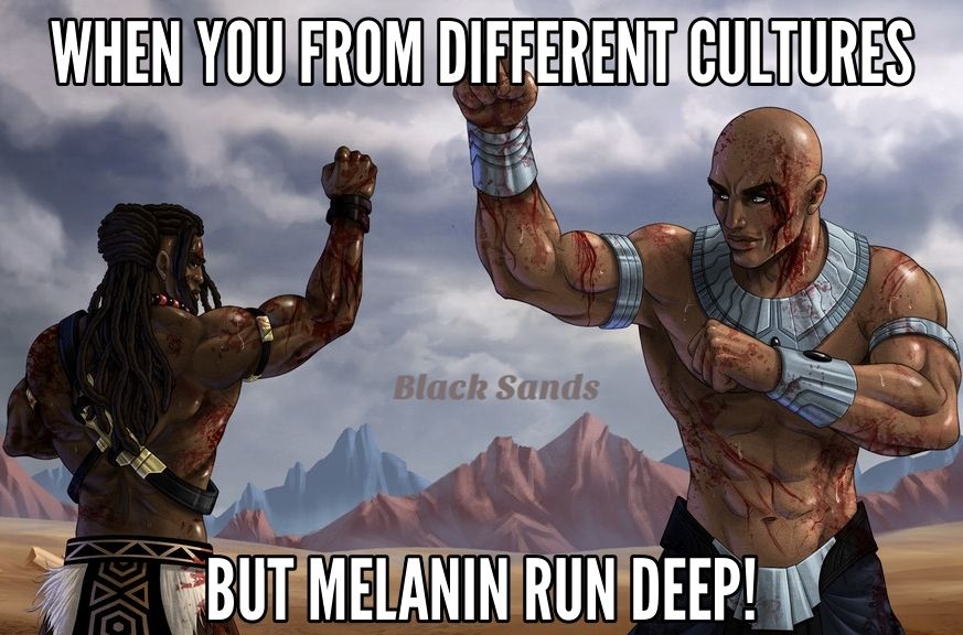
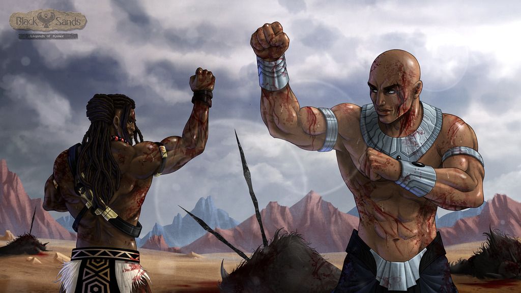
\
The artwork itself is very good. Especially the shading and lighting (gonna assume the sun is breaking through on that overcast day).

However your use of the negative space available to you is hurting this composition. At first glance looks like the guy on the right is bigger even though that I know that wasn't your intent.
There are tons of ways you can fix this, but the easiest by far would be to exaggerate the difference a bit more.
-Make the guy on the right bigger and slide him more out of frame to the right. (adding stronger self shadows in the chin area and under his left arm)
-Make the guy on the left smaller and slide him more towards the center
Very good overall though


.jpg/revision/latest/scale-to-width-down/366?cb=20140102101354)

