
You are using an out of date browser. It may not display this or other websites correctly.
You should upgrade or use an alternative browser.
You should upgrade or use an alternative browser.
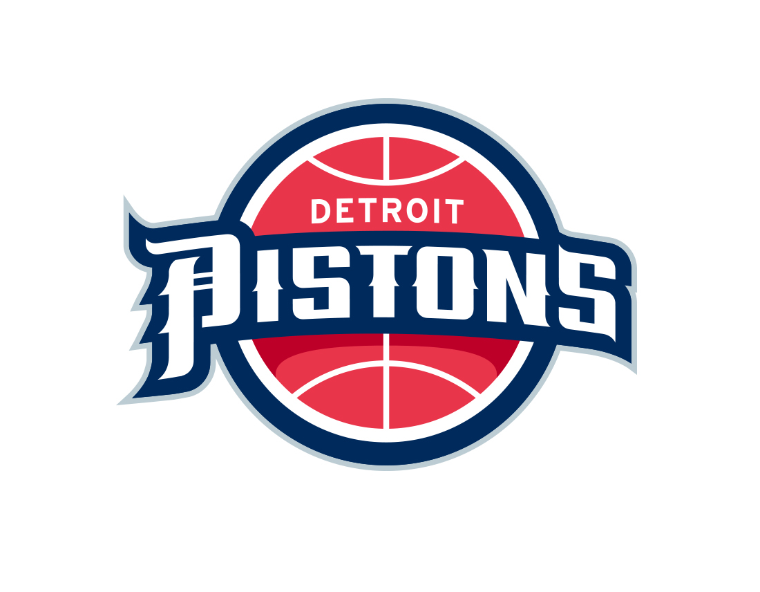
Peep the Detroit Pistons new logo
- Thread starter JordanWearinThe45
- Start date
More options
Who Replied?
Dillah810
Flat Girther
Personally, I hate it when teams go back to an old logo. It's like admitting defeat on trying anything new and innovative.
Personally, I hate it when teams go back to an old logo. It's like admitting defeat on trying anything new and innovative.
Sometimes the old logo is the best and it was left behind cause of idiocy
Personally, I hate it when teams go back to an old logo. It's like admitting defeat on trying anything new and innovative.
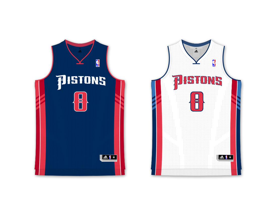
To be fair the Teal era was hot garbage breh...Jerseys looked like a bad SNES game.

They actually pay dudes six figure salaries to come up with corny ass extra explanations like this.
"Thin, anatomically correct basketball groove lines"

nikka it's a basketball outline with DETROIT PISTONS written on it. Shut the fukk up

Marco Andretti
GRINDHARD
They should go back to the old logo.
But with today's colors ..it would be raw .

But with today's colors ..it would be raw .
Dillah810
Flat Girther
Sorry. I refuse to believe that you can never improve on a logo. It's just lazy and unimaginative.Sometimes the old logo is the best and it was left behind cause of idiocy
David_TheMan
Banned
You're probably one of those cats would would argue about changing the Cowboys, Steelers, and Packers logo because it doesn't have anotamacilly correct lines and etc.Sorry. I refuse to believe that you can never improve on a logo. It's just lazy and unimaginative.
A kid who prefers flash lights and appeal to newness instead of recognizing the gold mine you have in an established historical logo
Dillah810
Flat Girther
Designers do better rebrands on their personal time, than the shyt the owners pay for.


Dillah810
Flat Girther


secondary logo is cool, rest is some McDowell's-McDonald's type similarities
didnt really need a roll-out
didnt really need a roll-out
Dillah810
Flat Girther
No, I don't like new or the sake of newness. In fact the best designs are one that adapts old ascetics, yet finds a new approach to it.You're probably one of those cats would would argue about changing the Cowboys, Steelers, and Packers logo because it doesn't have anotamacilly correct lines and etc.
A kid who prefers flash lights and appeal to newness instead of recognizing the gold mine you have in an established historical logo
David_TheMan
Banned
Looks terrible
Lmao factsThey likely paid someone 6 figures to do this, what a finesse