Saysumthinfunnymike
VOTE!!!
Damn these new match graphics are an eye sore
The commercial reminded me of 'Spy vs. Spy'
Damn these new match graphics are an eye sore
Check the OP I updated them. Too much white. Last year was pretty bad too. Lots of yellow.The commercial reminded me of 'Spy vs. Spy'
 This cena run getting worse and worse. Should’ve just let him go out as a face.
He acts exactly the same and wrestles exactly the same regardlessThis cena run getting worse and worse. Should’ve just let him go out as a face.
Cena basically on his Okada in AEW shyt, but with more dikk kicks, and one two douchebag entertainers (Logan and Fern).Cena's whole thing is that he's always been the same, so it makes sense that he hasn't changed anything besides dropkicking MFs in the nuts and belt shots.

Cena basically on his Okada in AEW shyt, but with more dikk kicks, and one two douchebag entertainers (Logan and Fern).
While it's interesting Cena going left, dude might as well just become Bob Backlund with Jorts
Damn these new match graphics are an eye sore
This is not even an exaggeration when I say I made better graphics in computer lit in middle school.
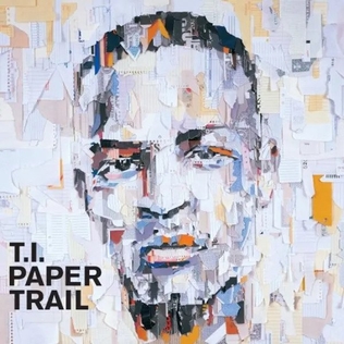
 I respectably disagree... someone on the WWE graphic's department must be a fan of T.I. since this year's Money In The Bank graphics reminds me of the "Paper Trail" album cover
Not mad at the style. It's just more the white background. It's jarring when there is a lot of it. Like last year it was a whole lot of yellow background.I respectably disagree... someone on the WWE graphic's department must be a fan of T.I. since this year's Money In The Bank graphics reminds me of the "Paper Trail" album cover

It's pretty clear Okada has been on cruise control knowing he's going to have a match with Omega; Kevin Knight even called him out on that a few weeks ago. Just have to hope that when it happens in AEW, it's not the same result as the underwhelming Styles/Nakamura feud from several years ago.


I respectably disagree... someone on the WWE graphic's department must be a fan of T.I. since this year's Money In The Bank graphics reminds me of the "Paper Trail" album cover

Damn these new match graphics are an eye sore