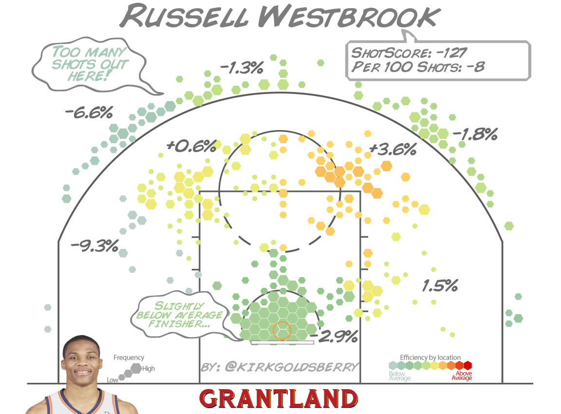
Here's a lot of charts based solely on season numbers. Note, for example, how smooth the shooting charts are. If you really couldn't make an accurate assessment, then those shooting charts would be all over the place. But they're smooth as hell - which shows that on both offense and defense, the advanced analytics really are telling you what spots a player likes and (part of) what effect he's having on the game.
Also notice how the defensive shot charts are far more evenly distributed than the offensive shot charts? That shows you're seeing unique individual differences - while a single player on offense is taking his shots best and most frequently from a certain place, the defensive shots show that these choices are clearly different enough across the league that the distributions even out a lot.