A slightly tweaked app drawer design
The app drawer on both Google Play Edition devices has been scaled down; it now has four icons in each row instead of five, as is the case on the Nexus 4. This makes for a less dense and more spaced-out appearance.
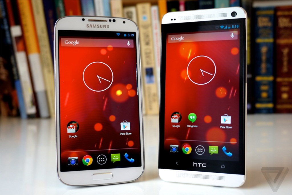
A new live wallpaper
The default wallpaper on both the Galaxy S4 and HTC One Google Play Edition is something called Sun Beam. It's basically a red- and orange-tinted version of the Phase Beam live wallpaper that's been a part of Android for a while now.
A different boot animation
This last one's likely something made explicitly for these Google Play Edition devices, but it's new and interesting nonetheless: a different boot animation.
It makes sense, since these aren't actually Nexus devices and thus wouldn't use the Nexus boot animation -- but also aren't traditional Samsung and HTC devices and wouldn't use those companies' animations, either.
Here's what both phones show at startup instead (this video also demonstrates the aforementioned new live wallpaper and app drawer design)
A new Camera app interface
In place of the circular series of options that appears when you touch your finger to an open area in the current stock Android Camera app, the new Google Play Edition devices utilize an updated semicircle design -- a curved line that appears above your finger with five options.
The options, in order, are toggling HDR mode, adjusting the exposure, accessing more options, adjusting the flash mode, and switching between the front and rear camera.
When you move your finger over "More Options," a new semicircle appears slightly higher up on the screen with five new choices: toggling whether location data is stored with images, activating a countdown timer, adjusting the image size, adjusting the white balance, and selecting a scene mode. Most subsequent options appear in similar semicircle UIs instead of more traditional pop-up menus; the exception, curiously, is "Picture Size," which still uses a pop-up menu (and kind of sticks out like a sore thumb as a result).


 oh the google editions. Can't you just install cymod 10.1 and get damn near real time vanilla?


 see thats the issue with you fools everything is about numbers. Before the iphone did you know how many phones blackberry or palm or those dummy phones sold??? Now its all about flop or smash. This is not hip hop music calm your ass down. Google dont care about numbers if so the nexus line would of been dead at nexus one. The galaxy nexus was released at 750$. It was released on verizon at $299. How quickly people forget. Google plasy store subsizided the galaxy nexus. The android lead clearly said the nexus line wont die